Explaining Model on SQLFlow Tutorial
The Explainer is designed to explain the machine learning model in SQLFlow. In this tutorial, you will learn how to,
- Train an XGBoost tree model on the Boston housing dataset.
- Explain the trained model using
TO EXPLAINSQL statements.
You can find more SQLFlow usages from the Language Guide.
We implement the explainer based on SHAP. By SQLFlow, an EXPLAIN SQL will be translated to the SHAP code. SQLFlow enables the code to read the dataset and load the trained model, then draws a figure to explain the model. At this stage, SQLFlow supports using the TreeExplainer to draw a summary plot.
Syntax
SELECT * FROM tbl
TO EXPLAIN a_trained_model
WITH
  summary.parameter_i=value_i ...
USING TreeExplainer;
- A standard SQL statement used to specify the dataset.
TO EXPLAINintroduces the model to explain.USING TreeExplainerrestricts the explainer.- By
WITH, we specify the parameters to summary_plot with a prefixsummary.like:summary.plot_type=\"bar\".
The Dataset
We use the boston housing as the demonstration dataset.
First, we train a model to fit the dataset. Next, we write an EXPLAIN SQL to get an overview of which features are most important for the model.
Train a Model
%%sqlflow
SELECT * FROM boston.train
TO TRAIN xgboost.gbtree
WITH
    objective="reg:squarederror",
    train.num_boost_round = 30
COLUMN crim, zn, indus, chas, nox, rm, age, dis, rad, tax, ptratio, b, lstat
LABEL medv
INTO sqlflow_models.my_xgb_regression_model;
Explain the Model
We can plot the SHAP values of every feature for every sample.
%%sqlflow
SELECT *
FROM boston.train
TO EXPLAIN sqlflow_models.my_xgb_regression_model
WITH
    summary.plot_type="dot",
    summary.alpha=1,
    summary.sort=True
USING TreeExplainer;

The plot above sorts features by the sum of SHAP value magnitudes over all samples, and use SHAP values to show the distribution of the impacts each feature has on the model output. The color represents the feature values(red high, blue low). This reveals for example that a high LSTAT(% lower status of the population) lowers the predicted home price.
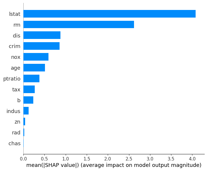
We can also just take the mean absolute value of the SHAP values for each feature to get a standard bar plot:
%%sqlflow
SELECT *
FROM boston.train
TO EXPLAIN sqlflow_models.my_xgb_regression_model
WITH
    summary.plot_type="bar",
    summary.alpha=1,
    summary.sort=True
USING TreeExplainer;
